Data Shape
There are many ways to visualize the shape of data. Arguably, the best way of doing it is by means of the frequency distribution.
Virtually all data characteristics (descriptors) and be derived from the frequency (probability) distribution. Graphically, the frequency distribution can be visualized as a pie chart or column chart.
A column chart for the frequency distrubution of a continuous variable is referred to as a histogram. This section is dedicated to analyzing the data shape for empirical data (samples). The shape of the theoretical random variables is determined by mathematical functions (see discrete and continuous probability distributions).
Other ways to learn more about the data shape are: stem and leaf diagram, box plot,
and such summary measures as skewness and kurtosis.
A Frequency Distribution can serve as an empirical (sample) probability distribution. There are two versions of the distribution: absolute, fn(class), and relative, f(class). The absolute frequency distribution shows how many sample members belong to each class (element of the domain). The relative one shows the same information but expressed percentagewise (relative to the sample size, n).
With respect to the categorical variables, the classes are made of the elements of the variable's domain. Given the domain consists of classes (categories) D = {c1, c2, ..., cm} and the sample (of size n) is a collection of class instances (categories), X = {cr(1), cr(2), ..., cr(n)}, where r(k) is the kth element of the sample, X, selected randomly from domain D with replacement, the frequency distribution is defined as follows:
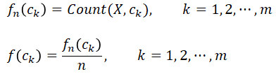
Function Count(X, ck) returns the count of domain member (category) ck in sample X (the number of times ck appears in the sample). Here X is a simple random sample (a sample in which each member has been selected randomly with the same probability).
Example - Categorical Frequency Distribution
Recall the sample and domain presented in Data Types:
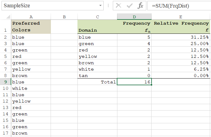
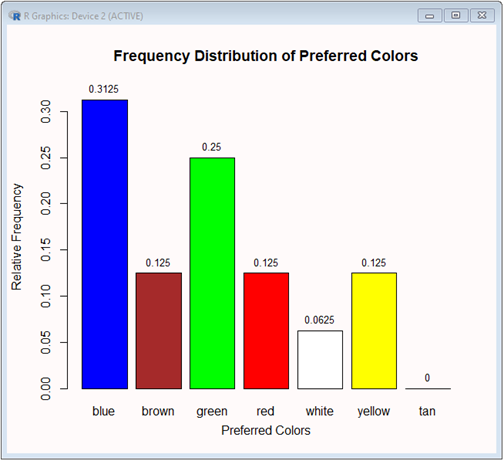
CP = {"blue", "blue", "green", "red", "green", "yellow", "brown", "blue", "white", "blue", "yellow", "red, "green", "blue", "green", "brown"}
D(CP) = {"blue", "green", "red", "yellow", "brown", "white", "tan"}
To find out the frequency distribution, we need to count how many times each element of the domain appears in the sample.
For example, "blue" appears in the sample 5 times. There are 16 members of in the sample. Thus fn("blue") = 5 and f("blue) = 5/16 = 0.3125. In this example, the sample and domain are small so all the counting could be done manually. However, spreadsheets and R can handle this job more efficiently and reliably.
Solution
Spreadsheet Solution
Named Ranges:
The formulas shown below, utilize named references. Before applying them explicitly, make sure that the ranges are named as follows:
A2:A17: PreferredColors
C2:C8: ColorDomain
D2:D8: FrqDist
D9: SampleSize
Probably the easiest way to create a spreadsheet named range is to select the range and enter its name in the Name Box (the left-hand side of the formula bar).
Formulas:
D2:D8: =COUNTIF(PreferredColors,ColorDomain)
Note:
The above formula is an array formula. To enter this formula, first select range D2:D8, next construct the whole formula, and finally press Enter while holding-down Ctrl.
To construct this formula you can type it in (a boring way) or you can use shortcut F3 to pick the formula's names from the list of spreadsheet names. In details this [fun] method looks like this:
select range D2:D8
type =COUNTIF(
press function key F3
pick name PreferredColors
type ,
press function key F3 again
pick name ColorDomain
type )
press Ctrl+Enter
D9: =SUM(FrqDist)
Note:
The next formula is also an array formula. Also here, to enter this formula, first select rangeE2:E8, next construct the whole formula, and finally press Enter while holding-down Ctrl.
The next formula is also an array formula. Also here, to enter this formula, first select rangeE2:E8, next construct the whole formula, and finally press Enter while holding-down Ctrl.
E2:E8: =FrqDist/SampleSize
Chart:
A table view of the frequency distribution is a good source of information about the random variable (CP) but the shape of the distribution is best shown using a column diagram.
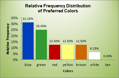 |
The following steps will generate the diagram with the categories (colors) assignned to the X-axis and the relative frequencies, f,—to the Y-axis.
1. Select range C2:C8. 2. Hold down Ctrl and select range E2:E8. 3. Select the Insert ribbon and pick the Column option among the Recommended Charts. 4. To customize the chart, select it and click the big plus button, 5. Make and customize the following selections:  |
This spreadshet solution is also available as an Excel workbook.
R Solution
# R Solution
# Get the sample.
preferredColors = c("blue","blue","green","red","green","yellow","brown","blue","white","blue","yellow","red","green","blue","green","brown")
# Using function table, count the existing colors.
frqDist = table(preferredColors)
frqDist
preferredColors
blue brown green red white yellow
5 2 4 2 1 2
# Notice that this is a simple solution. It does not use the domain.
# For every color contained in the domain that does not belong to the sample, the frequency value is zero.
# Add the missing color with the 0 frequency.
missing = 0
names(missing) = "tan"
frqDist = append(frqDist, missing)
frqDist
blue brown green red white yellow tan
5 2 4 2 1 2 0
# Get the relative frequency distribution.
f = frqDist/sum(frqDist)
f
blue brown green red white yellow tan
0.3125 0.1250 0.2500 0.1250 0.0625 0.1250 0.0000
# Visualize the relative frequency.
# Set the titles.
title = "Frequency Distribution of Preferred Colors"
yTitle = "Relative Frequency"
xTitle = "Preferred Colors"
# Increase the range of the Y-axist by 5%.
yRange = c(0, 1.05*max(f))
# Set the column colors.
clrs = c("blue","brown","green","red","white","yellow","tan")
# Change the chart's background color to "snow".
par(bg = "snow")
# Plot a column chart.
bp = barplot(f,ylab=yTitle, xlab=xTitle, main=title, ylim=yRange, col=clrs)
# Add the relative frequencies above the columns (font size = 80%).
text(x=bp, y=f, label=f, pos=3, cex=0.8)
There is a richer set of tools dedicated to generating frequency distributions of numeric variables. The two types of the variables, discrete and continuous, are processed differently.
The process of developing a frequency distribution for a discrete random variable is similar to the above process, involving a categorical variable. The text categories get replaced with numeric (integer) values. In the following exercise, you are asked to develop a frequency distribution for a discrete variable.
Q & A - Discrete Empirical Frequency Distribution
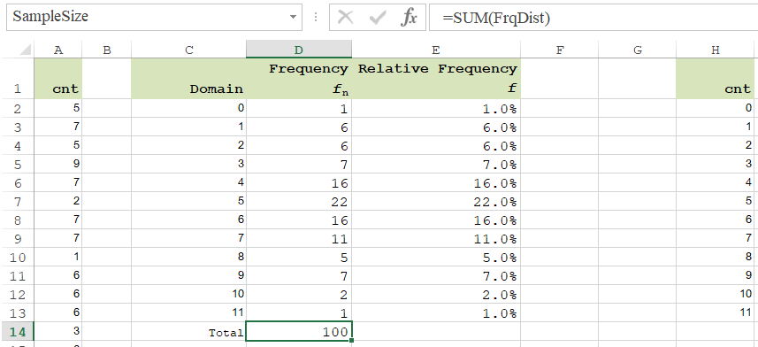
Jim Skewed is an owner of a car service shop, Jim's Auto Station. Because of increased demand for his service, Jim is considering a small expansion. Before making any specific decision, Jim has decided to closer analyze his situation. Going through his 100-day notes, he was able to determine the daily number of service requests. Jim has no reason to believe that customers' arrivals have not been random nor independent. During the first 10 days, the numbers or customer arrivals (requests for service) were: 5, 7, 5, 9, 7, 2, 7, 7, 1, 6. His full sample can be downloaded from Arrivals. Jim wants to know how frequently the number of the customers' arrivals was 0, 1, 2, etc.

Solution
Spreadsheet Solution
Named Ranges:
The formulas shown below, utilize named references. Before applying them explicitly, make sure that the ranges are named as follows:
A2:A101: Cnt
C2:C13: CntDomain
D2:D13: FrqDist
D14: SampleSize
Formulas:
D2:D13: =COUNTIF(Cnt,CntDomain)
Note:
The above formula is an array formula. To enter this formula, first select range D2:D13, next construct the whole formula, and finally press Enter while holding-down Ctrl.
To construct this formula you can type it in (a boring way) or you can use shortcut F3 to pick the formula's names from the list of spreadsheet names. In details this [fun] method looks like this:
select range D2:D13
type =COUNTIF(
press function key F3
pick name Cnt
type ,
press function key F3 again
pick name CntDomain
type )
press Ctrl+Enter
D14: =SUM(FrqDist)
Note:
The next formula is also an array formula. Also here, to enter this formula, first select rangeE2:E8, next construct the whole formula, and finally press Enter while holding-down Ctrl.
The next formula is also an array formula. Also here, to enter this formula, first select rangeE2:E8, next construct the whole formula, and finally press Enter while holding-down Ctrl.
E2:E13: =FrqDist/SampleSize
Chart:
A table view of the frequency distribution is a good source of information about the random variable (Cnt) but the shape of the distribution is best shown using a column diagram.
 |
The following steps will generate the diagram with the categories (colors) assignned to the X-axis and the relative frequencies, f,—to the Y-axis.
1. Select range C2:C13. 2. Hold down Ctrl and select range E2:E13. 3. Select the Insert ribbon and pick the Column option among the Recommended Charts. 4. To customize the chart, select it and click the big plus button, 5. Make and customize the following selections: |
This spreadshet solution is also available as an Excel workbook.
R Solution
# R Solution
# Get the sample from the Web document (src). Read them as integers and skip the first line (the header).
src = "http://doingstats.com/x/tier2/datashape/data/arrivals.txt"
cnt = scan(file=src, what=integer(), skip = 1)
cnt
[1] 5 7 5 9 7 2 7 7 1 6 6 6 3 6 5 5 8 7 6 1 7 11 4 6 5
[26] 7 5 4 4 1 6 4 5 4 3 1 8 5 7 5 5 5 4 9 2 4 7 3 6 4
[51] 2 7 2 6 9 7 6 1 9 9 3 6 9 4 4 4 9 6 5 4 5 3 4 6 10
[76] 5 4 5 4 6 5 8 0 5 6 5 8 5 3 1 5 6 8 5 2 3 2 10 4 5
# Using function table, count the existing counts.
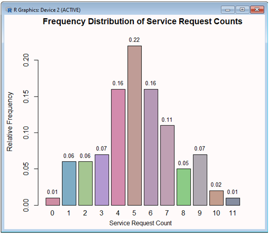
frqDist = table(cnt)
frqDist
cnt
0 1 2 3 4 5 6 7 8 9 10 11
1 6 6 7 16 22 16 11 5 7 2 1
# Notice that this is a simple-based solution. We can't use the entire domain, since it is infinite.
# Get the relative frequency distribution.
f = frqDist/sum(frqDist)
f
cnt
0 1 2 3 4 5 6 7 8 9 10 11
0.01 0.06 0.06 0.07 0.16 0.22 0.16 0.11 0.05 0.07 0.02 0.01
# Visualize the relative frequency.
# Get the size of the frequency distribution.
n = length(f)
# Set the titles.
title = "Frequency Distribution of Service Request Counts"
yTitle = "Relative Frequency"
xTitle = "Service Request Count"
# Increase the range of the Y-axist by 5%. This is needed to make more room for data lables to be placed above the columns.
yRange = c(0, 1.05*max(f))
# Set random column colors (each of the R, G, B color components is set randomly between 45% and 85%).
clrs = rep(0,n)
for (ndx in 1:n) clrs[ndx] = rgb(runif(1,min=0.45,max=0.85), runif(1,min=0.45,max=0.85), runif(1,min=0.45, max=0.85))
# Change the chart's background color to "snow".
par(bg = "snow")
# Plot a column chart.
bp = barplot(f,ylab=yTitle, xlab=xTitle, main=title, ylim=yRange, col=clrs)
# Add the relative frequencies above the columns (font size = 80%).
text(x=bp, y=f, label=f, pos=3, cex=0.8)
In a frequency distribution of a continuous random variable, the categories are adjecent class intervals. Let's have the limits of the intervals be denoted by sequence l0, l1, l2, ..., lm. This sequence is defined recursively:
lj+1 = lj + w, j = 0, 1, 2, ..., m-1.
Thus, in order to create the intervals, (l0, l1], (l1, l2],(l2, l3], ..., (lm-1,lm], all we need is the left limit of the first interval, l0, the width of the interval, w, and the number of the intervals, m. Notice that notation (lj, lj+1] means that the lower limit is exclusive and the upper limit is inclusive. Therefore, when determining if a sample value, xk, from sample {x1, x2, ..., xn}, falls in the interval, it must be greater that the lower limit (lj) and less than or equal to the upper limit (lj+1).
lj < xk ≤ lj+1
Before we can set the intervals, we must determine the values of m, w, and l0. A few rules of thumb will help us do this.
To find out the number, m, of the class intervals the following hints can be tried (n is the sample size):
5 ≤ m ≤ 20
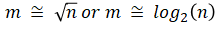
These are just good hints. For a very large sample, m can ve greater than 20. Many statisticians select m to be a little smaller than the suggested one. Overall, the frequency distribution itself, will the ultimate judge. If there are empty or poorly populated intervals, m should be reduced. On the other hand, if some intervals seem to be overcrowded, m should be increased. This is why, coming up with the right setup may require a few trials.
Once parameter m has been determined, the width of the intervals, w, can be set close to the sample range divided by the number of the intervals, m:
In most situations, the final value of the width, w, works well when its value is slightly greater than the suggested one.
Wherever possible, the interval width, w, should be set to a friendly or convenient value
Wherever possible, the interval width, w, should be set to a friendly or convenient value
The left limit, l0, of the first interval is expected to be set close to the sample minimum, min(x1, x2, ..., xn).
If the limit is equal to or greater than the minimum, then the first interval will becomeopen-ended, (-∞, l0].
Such a solution is recommended particularly if the resulting frequency distribution is going to be scrutinized by a [theoretical] probability distribution.
Otherwise, setting the limit to a friendly or convenient value a little below min(x1, x2, ..., xn) should work just fine.
Having the three parameters (m, w, and l0) defined, the limits of the intervals, l0, l1, l2, ..., lm, can be defined recursively, as shown above. Next, the sample and the limits are used to generate the frequency distribution (counts of sample values in each interval). The counts are lower-limit exclusive and upper-limit inclusive.
In a spreadsheet, function FREQUENCY or COUNTIF will do the job. In R, function hist (histogram) is the best choice.
Spreadsheet Formula
Given X is the sample range, and Bin is the interval limit range, the following function will generate the absolute frequency distribution:
In order to enter this function, first select a range parallel to the Bin range plus one extra cell. Notice that the FREQUENCY function also counts the number of the sample values beyond the last interval limit ( lm). Next, type the function (do not press the Enter key). When you close the right parenthesis, hold down Shift + Ctrl and press Enter.
R Formula
With the sample defined as vector x and the bin range—as sequence from l0 to lm, incremented by w., execute the hist (histogram) function:
Notice that R refers to the bin range as breaks.
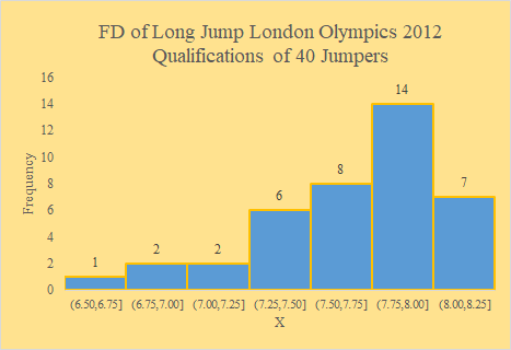
Example - Continuous Frequency Distribution
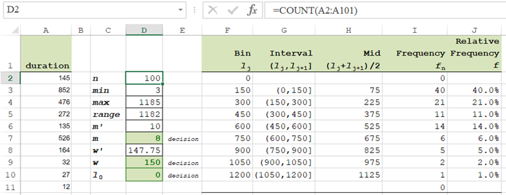
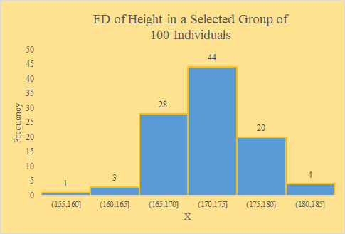
Let's extend the Jim's Auto Station case shown above for a discrete variable. In addition to analyzing the service request counts, Jim wants to better understand the service durations. He checked his document and was able to produce a sample of durations for the recent 100 services. The first 10 times [in min] are: 145, 852, 476, 272, 135, 526, 164, 32, 27, 12.
The full sample is available on page Jim's Service Durations. The durations are of the Real type even so thay are rounded to a minute. The first important step in analyzing this sample is to find out its shape, more precisely—the shape of the frequency distribution. Jim wants to see this distriubution as a frquency table and histogram.
The full sample is available on page Jim's Service Durations. The durations are of the Real type even so thay are rounded to a minute. The first important step in analyzing this sample is to find out its shape, more precisely—the shape of the frequency distribution. Jim wants to see this distriubution as a frquency table and histogram.
Solution
Spreadsheet Solution
The duration sample resides in range A2:A101. It is aleady loaded in the attached workbook.
Formulas
Each of the following steps shows a cell or range to be selected, followed by a formula to be entered. Notice that the FREQUENCY function must be entered by holding down Shift & Ctrl and simultaneously pressing Enter.
D2: =COUNT(A2:A101)
D3: =MIN(A2:A101)
D4: =MAX(A2:A101)
D5: =D4-D3
D6: =SQRT(D2)
D8: =D5/D7
F2: =D10
F3: =F2+$D$9
Copy F3 to F4:F10
G3:="("&F2&","&F3&"]"
Copy G3 to G4:G10
H3:=AVERAGE(F2:F3)
Copy H3 to H4:H10
I2:I11: =FREQUENCY(A2:A101,F2:F10)
Press [Shift + Ctrl] + Enter (Return)
J3:=I3/$D$2
Copy J3 to J4:J10
Chart
- Select range G3:G10 (X-axis)
- Hold down Ctrl and, simultaneously, select range J3:J10 (Y-axis)
- Select the INSERT ribbon and pick option Insert Column Chart (choose the first 2-D pattern).
- Stretch the chart so you can see the interval limits horizontally.
- Point to any column and click the right mouse-button.
- Pick option Add Data Labels.
- Again, point to any column and click the right mouse-button.
- This time select option Format Data Series.
- In the Series Options form, reduce the gap to 0%.
- Select the Fill & Line form and set the Border color to Orange.
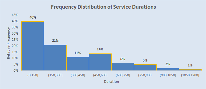
- Overwrite the chart title with title "Frequency Distribution of Service Durations".
- Make sure that the chart is selected. If not, click it near its edge.
Click the big + button and select option Axis Titles.
Customize the titles as "Relative Frequency" (for Y) and "Duration" (for X).
Your chart should be similar to the following one:
R Solution
# R Solution
# Get the sample from the Web document (src). Read them as integers and skip the first line (the header).
src = "http://doingstats.com/x/tier2/datashape/data/service.txt"
duration = scan(file=src, what=double(), skip = 1)
duration

# Get the size of the sample.
n = length(duration)
n
[1] 100
# Set the titles of the chart (histogram).
title = "Frequency Distribution of Service Durations"
yTitle = "Absolute Frequency"
xTitle = "Service Time"
# Set the backgroung color of the chart.
par(bg = "palegreen")
# Using function hist, generate the histogram. Let R figure out the interval limits. Show the frequencies
# above the columns. Use color "darkgreen" for the chart's column.
fdh = hist(duration, labels=TRUE, col="darkgreen", main=title, xlab=xTitle, ylab=yTitle)

# The absolute frequencies (counts) are:
fdh$counts
[1] 49 21 16 6 6 2
# Get the number of the class intervals.
m = length(fdh$counts)
m
[1] 6
# Get the relative frequencies (the absolute frequencies divided by the sample size).
rfd = fdh$counts/n
rfd
[1] 0.49 0.21 0.16 0.06 0.06 0.02
# Show a frequency distribution table, fdt, (similar to that of spreadsheet).
leftLimit = fdh$breaks[1:m]
leftLimit
[1] 0 200 400 600 800 1000
rightLimit = fdh$breaks[2:(m+1)]
rightLimit
[1] 200 400 600 800 1000 1200
fdt = data.frame(left=leftLimit, right=rightLimit, fn = fdh$counts, f = rfd)
fdt
left right fn f
1 0 200 49 0.49
2 200 400 21 0.21
3 400 600 16 0.16
4 600 800 6 0.06
5 800 1000 6 0.06
6 1000 1200 2 0.02
Notice that the relative frequency distribution (f) can be used to assess some probabilities related to the service durations. Since duration is a continuous random variable, a convenient tool for such an assessment is the cumulative frquency ditribution.
Page Exploratory Analysis is dedicated more to such problems.
In this document, we are focusing on the shape of the distribution.
The frequency distribtion for variable duration is exremly [right] skewed. It resembles an Expenential probability distribution.
A Google Sheets solution, utilizing both function Frequency and function CountIf, is presented in document Frequency Distribution for Bullet Speed.
A stem & leaf diagram of numeric values consists of the portion of the higher significant digits (stem) combined with a list of the least significant digits (leaves). Typically, the stem and leaves are seperated with a vertical bar (|).
Example - Stem & Leaf
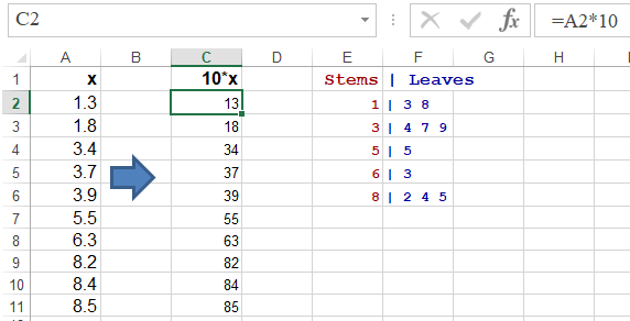
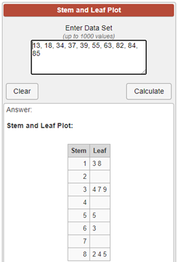
Suppose that a sample consists of real numbers between 0 and 9, with one decimal place of precision:
x = {3.7, 8.5, 8.2, 8.4, 1.8, 3.4, 5.5, 1.3, 6.3, 3.9}
Manual Solution
The first step in creating the is to sort the sample in the ascending order.
x = {1.3, 1.8, 3.4, 3.7, 3.9, 5.5, 6.3, 8.2, 8.4, 8.5}
Here the stem of the diagram will be represented by the whole part of the numers and the digits after the decimal point will make the leaves. The stem values to be placed each on a separate line are: 1, 2, 3, 5, 6, and 8. The leaves are 3, 8 for stem 1, 4 for stem 2, 7 and 9 for stem 3, 5 for stem 5, 3 for stem 6, and 2, 4, 5 for stem 8:
1 | 38
3 | 479
5 | 5
6 | 3
8 | 235
3 | 479
5 | 5
6 | 3
8 | 235
Spreadsheet Solution
Download a macro workbook Stem and Leaf Plot Generator. The above sample is shown one sheet Sample7. In oder to use macro StemAndLeafGenerator, the sample must be converted to whole numbers (here muliplied by 10). Use the VIEW ribbon and select option Macros. Run the StemAndLeafGenerator macro and select range $C$2:$C$11. This will show the digits of tens as stems and the digits of units as leaves. The macro produces the following output:
R Solution
# R Solution
# Set up the sample
x = c(3.7, 8.5, 8.2, 8.4, 1.8, 3.4, 5.5, 1.3, 6.3, 3.9)
# Generate the plot.
stem(x, scale=2)
Notice that R also shows the stem value for slots 2, 4, and 7 even so there are no numbers in the sample with the higher significant digit of 2, 4, or 7. This result is not fully compatible with the definition of the empirical frequency distribution. The width, w, of the intervals is 1. A clearer shape, although somewaht similar, can be produced by the hist function.
hist(x, labels=TRUE, col="tan")
For this histogram R used the width, w,of the interval of 2.
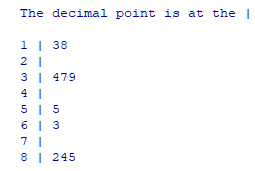
Web (Online) Solution
For the sample, x, mutiplied by 10 (converted to whole numbers), x = {37, 85, 82, 84, 18, 34, 55, 13, 63, 39}, page Stem and Leaf Plot Generator produces the following plot:
Contrary to the frequency distribution setup, the allocation of the leaves is inclusive with respect to the lower limits and—exclusive for the upper limits.
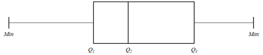
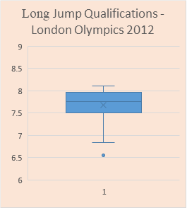
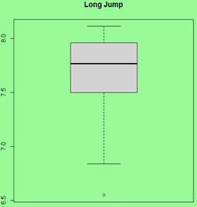
A Box Plot, also referred to as a Box & Whisker Plot, is based on the 5-number summary measures: Min, 1st Quartile, 2nd Quartile (Median), 3rd Quartile, and Max. The 1st Quartile, 2nd Quartile (Median), 3rd Quartile are shown as (box). The Min and Max values as depicted by the whiskers.
This is not the only definition of this diagram. If the sample has outliers, then the whiskers will extend 3/2 of the Interquartile Range (IQR = Q3 - Q1) below the 1st Quartile (Q1) and above the 3rd Quartile (Q3). The following example shows such a diagram for a sample with 3 potential outliers in the lower range and—2 in the upper range.
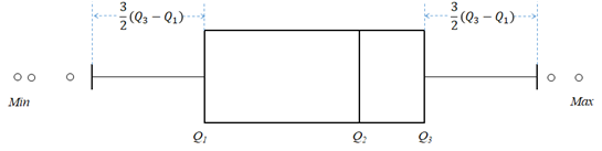
The outliers are shown as tiny circles. The whiskers (delimiting outliers) are marked at points referred to as a Lower Inner Fence (LIF) and Upper Inner Fence (UIF).
LIF = Q1 - (3/2) · IQR
UIF = Q3 + (3/2) · IQR
UIF = Q3 + (3/2) · IQR
There are also limits (fences) that are supposed to identified boundaries for the so called extreme outliers. Their Lower Outer Fence (LOF) and Upper Outer Fence (UOF) are defined the distance of 3 Interquartile Range:
LOF = Q1 - 3 · IQR
UOF = Q3 + 3 · IQR
UOF = Q3 + 3 · IQR
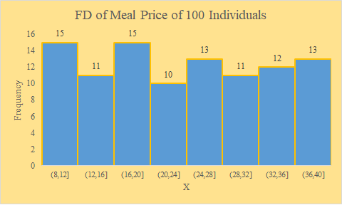
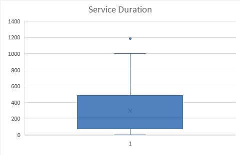
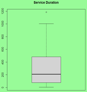
This type of diagram is a simple but powerful plot that clearly shows the shape of data. Let's show side-by-side Box Plots and Histograms for a few samples that have been selected from negatively (left) skew, symmetric-uniform, symmetric-normal, and positively (right) skewed populations. The Box & Whisker Plots are generated in Excel and R and the histogram in Excel (from left to right).
| Spreadsheet Box | R Box | Spreadsheet Histogram |
| A Left (Negatively) Skewed Sample | ||
| Workbook |
# Code:
src = "http://doingstats.com/x/tier2/datashape/data/long_jump.txt"
jump = scan(file=src, what=double(), skip = 1)
boxplot(jump, main="Long Jump")
|
Workbook |
 |
 |
 |
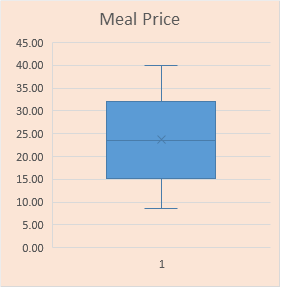
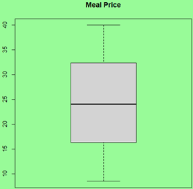
| A Symmetric-Uniform Sample | ||
| Workbook |
# Code:
src = "http://doingstats.com/x/tier2/datashape/data/meal_price.txt"
mp = scan(file=src, what=double(), skip = 1)
boxplot(mp, main="Meal Price")
|
Workbook |
 |
 |
 |
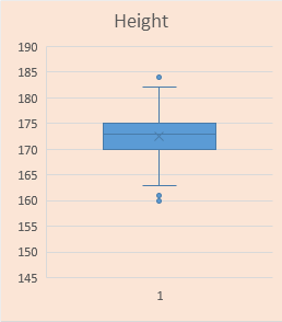
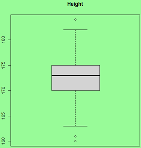
| A Symmetric-Normal Sample | ||
| Workbook |
# Code:
src = "http://doingstats.com/x/tier2/datashape/data/height.txt"
height = scan(file=src, what=double(), skip = 1)
boxplot(height, main="Height")
|
Workbook |
 |
 |
 |
| A Right (Positively) Skewed Sample | ||
| Workbook |
# Code:
src = "http://doingstats.com/x/tier2/datashape/data/service.txt"
duration = scan(file=src, what=double(), skip = 1)
boxplot(duration, main="Service Duration")
|
Workbook |
 |
 |
 |
Note: you can show easily other measures on the box in R. For example, to show the mean of the service duration as a read diamond (pch=23) do this:
points(mean(duration), pch = 23, col="red")
One can clearly see a difference between the left skewed and right skewed shapes. In interesting distinction between the uniform and Normal shapes if the the former is significantly "fatter".
A histogram is an ultimate data shape presenter. However a box plot is simpler and easier to handle. Moreover, box plot can be generated for multiple sample, making it easier to compare the shapes and the major summary measures of the samples.
References
| Wikipedia-Empirical-Distribution (2020). Empirical distribution function. URL - Source | |
| Wikipedia-Stem&Leaf (2020). Stem-and-leaf display. URL - Source | |
| Doing Stem & Leaf (2020). Stem and Leaf Plot Generator. URL - Source | |
| Wolfram-Box (2020). BoxWhiskerPlot. URL- Source | |
| Box Plot Generator (2020). Statistics Calculator: Box Plot. URL - Source | |
| Letkowski, J. (2014). A spreadsheet based derivation of the probability distribution from a random sample. Journal of Business Cases and Applications. ISSN Online: 2156-9673. URL-Source | |
| Wikipedia-Box-Plot (2020). Box plot. URL - Source |